District Logos
Manawa Logo Style Guide
These guidelines have been adopted from the University of Michigan style guide.
Using our logo
The Clear-space Rule
Our wolf logo is part of our tradition and is an important part of our history. Please show respect when using our logo.
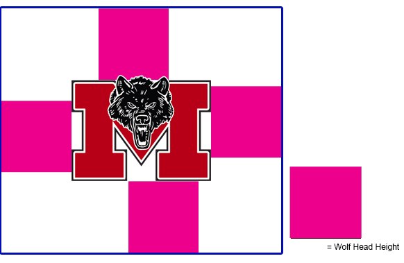
Always position the logo for maximum impact and give it plenty of room to breathe. This will help to ensure our logo’s visibility and legibility.
The minimum clear space for the Manawa logo is defined as the height of the wolf head. Understanding the clear-space rule is essential, as it is also the standard for logo position and scale on most printed communications. In that regard, the clear space rule should be maintained as the logo is proportionately enlarged or reduced in size

Minimum size
When reproducing our logo, be conscious of its size and legibility. Use common sense — a signature that is too small ceases to serve any useful communication function. Generally, our logo should never appear less than 3/8" tall in printed materials, and no less than 36px tall in the digital realm.
Do the Right Thing
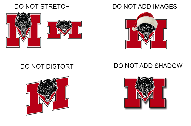
The School District of Manawa logo has been carefully designed and should never be altered in any way. These examples illustrate how NOT to use the logo, but do not include all instances of misuse.
Do not:
Alter the marks in any way.
Use any part of the marks, including the M, as part of another word.
Redesign, redraw, animate, modify, distort, or alter the proportions of the marks.
Surround the marks with—or place in the foreground over—a pattern or design.
Rotate or render the marks three-dimensionally.
Add words, images, or any other new elements to the marks.
Replace the approved typeface with any other typeface.
Enclose the marks in a shape or combine it with other design elements or effects.
Modify the size or position relationship of any element within the marks.
Add additional copy to the marks.
Examples Of Misusing Our Logo:
